Hamish Gill
Tech Support (and Marketing)
I asked Alfie if i could tinker with one of his wonderful street portraits.
Since he doesn't have the same version of lightroom I thought i would write a little bit about my process and post it as a thread for perhaps some dicussion on my techniques in the hope that I might get something out of this as well as Alfie.
This is Alfie's shot that i really liked

The original thread http://www.realphotographersforum.com/people-portraits/5326-candid-street-portraits.html
he sent me the dng file which i imported into LR4 and cropped in a similar way

I had a tinker and this is what I came up with

I cant show the process step by step with the effects as they are added but if you look at the side bar you can see what I have done
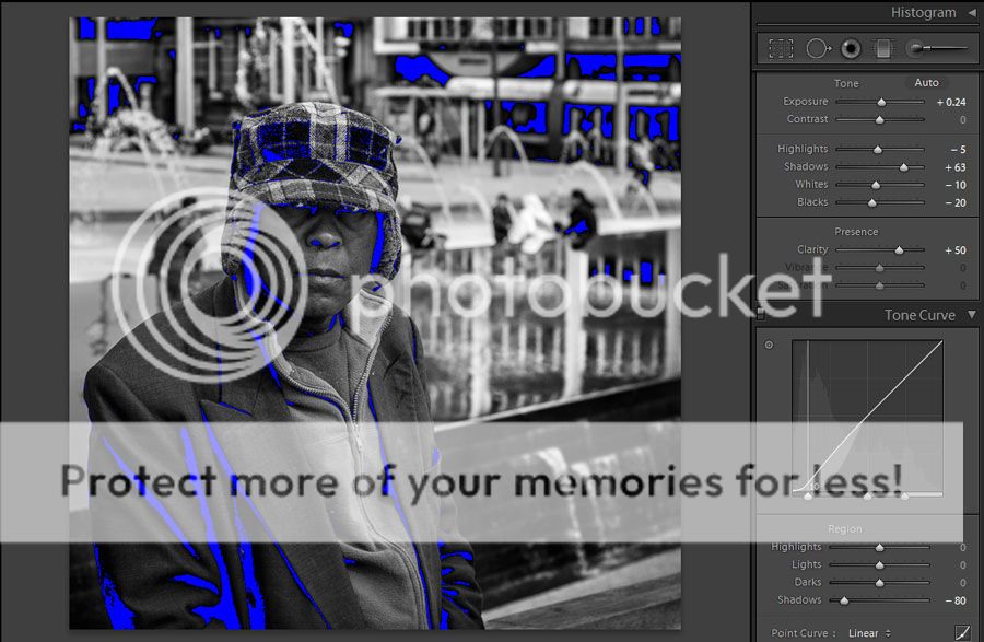
The first step was to adjust the exposure and contrast etc
I found that allowing any of the background elements to clip to white made them very distracting so as you can see here whilst there are lost shadows (denoted by blue) there are no lost highlights (usually shown by red). In case you aren't aware, pressing the "j" key in lightroom switches on the feature for showing lost highlights and shadows
Something I very often do in b&w conversions is to adjust the curves just in shadows and just in the darkest shadows. In lr4 i have found that upping the shadows and dropping the blacks in combo with this is a nice way to achieve a nice feel to the contrast. a similar effect could be had in previous versions of lr using fill light in the same way. (shadows replaced fill light in LR4)
The big boost to clarity is almost a must for me in B&W too
Here you can see my very subtle vignette settings and sharpening (note the use of 100 highlights on the vignette - this stops much of that greying to the highlights i mentioned i dont like)

I wanted to bring a bit more attention to the eyes ... i have infact over cooked it a little
first a local adjustment to lighten the area under the cap

some ott local adjustments to the eyes them selves ... i wouldn't recommend going this far if printing

I wanted to emphasise the reflection in the water so a local adjustment was applied there in this pattern twice over - 100% clarity then 70% clarity

the waterfall also needed bringing out a touch

instead of using the vignette control i often use a series of grads with a veriety of different settings
clarity in this case helped darken the dark parts of the background and make them a little stronger

same again with this one but with also a drop in shadows

and again

just shadows here but also a tweak up in exposure

then a tweak down in exposure to take some emphasis off the bit of concrete lower right foreground

And thats the lot!
I hope that is clear enough Alfie ... and indeed the sort of "look" you were going for!
Im very interested to hear your thoughts ... and anyone else's for that matter
I know i have used a lot of features that aren't in Lr2 but hopefully there is enough info for you to be able to translate backward
Since he doesn't have the same version of lightroom I thought i would write a little bit about my process and post it as a thread for perhaps some dicussion on my techniques in the hope that I might get something out of this as well as Alfie.
This is Alfie's shot that i really liked
The original thread http://www.realphotographersforum.com/people-portraits/5326-candid-street-portraits.html
he sent me the dng file which i imported into LR4 and cropped in a similar way
I had a tinker and this is what I came up with
I cant show the process step by step with the effects as they are added but if you look at the side bar you can see what I have done
The first step was to adjust the exposure and contrast etc
I found that allowing any of the background elements to clip to white made them very distracting so as you can see here whilst there are lost shadows (denoted by blue) there are no lost highlights (usually shown by red). In case you aren't aware, pressing the "j" key in lightroom switches on the feature for showing lost highlights and shadows
Something I very often do in b&w conversions is to adjust the curves just in shadows and just in the darkest shadows. In lr4 i have found that upping the shadows and dropping the blacks in combo with this is a nice way to achieve a nice feel to the contrast. a similar effect could be had in previous versions of lr using fill light in the same way. (shadows replaced fill light in LR4)
The big boost to clarity is almost a must for me in B&W too
Here you can see my very subtle vignette settings and sharpening (note the use of 100 highlights on the vignette - this stops much of that greying to the highlights i mentioned i dont like)
I wanted to bring a bit more attention to the eyes ... i have infact over cooked it a little
first a local adjustment to lighten the area under the cap
some ott local adjustments to the eyes them selves ... i wouldn't recommend going this far if printing
I wanted to emphasise the reflection in the water so a local adjustment was applied there in this pattern twice over - 100% clarity then 70% clarity
the waterfall also needed bringing out a touch
instead of using the vignette control i often use a series of grads with a veriety of different settings
clarity in this case helped darken the dark parts of the background and make them a little stronger
same again with this one but with also a drop in shadows
and again
just shadows here but also a tweak up in exposure
then a tweak down in exposure to take some emphasis off the bit of concrete lower right foreground
And thats the lot!
I hope that is clear enough Alfie ... and indeed the sort of "look" you were going for!
Im very interested to hear your thoughts ... and anyone else's for that matter
I know i have used a lot of features that aren't in Lr2 but hopefully there is enough info for you to be able to translate backward
")
")


