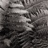
I think there's a lot to like about this, especially the way you have filled the frame and cropped to 'intensify' it further. However, I find the upper part of the image much more effective than the lower and that is possibly due to the orientation / density of the fronds. I think it cries out for a bit more uniformity, if that makes sense.