Don't Try This at Home

Vic Shaw

Senior Member
I don't know what to say about this really!


_DSC1884.jpg


Vic
 
You don't need to. It's good. I like it. Reminds me a bit of the shots in Blow-Up. Although it seems to have a very slight leftwards tilt. Maybe a tiny perpective adjustment would sort that (or maybe it's my eyes). Is that another person by the tree in the middle?
 
Thanks Pete, it's pretty level, there maybe a little lens distortion but I think it's as level as I can get it. There are a few people sitting on the benches, but I resisted the urge to get rid of them as they are pretty hard to see.


Vic
 
Composition is great as usual. I usually look at your shots and think Bollocks he's nailed the compo again, but it does make me (or start to at least) think harder about the compo on my shots. I like it even though it is a little busy but I think the gradients that have been pulled in on the sides are a bit too obvious especially on the sky (has grey tint to it) and the grass.
 
yes I figured they could stay as I didn't find them off putting and didn't fancy the cloning job.

Vic
 
Thanks Paul, even though your first thought was 'bollocks' when you saw this it seems!

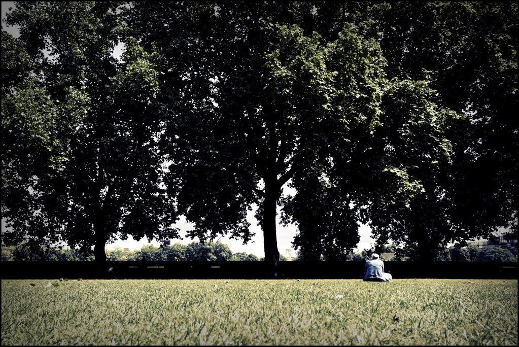
I had used a lomo-esk PP on this, 3 curves layers, red,green and blue, a gradiant map set to soft light and a vibrancy layer. When I do that I tend to use a heavier then normal vignette and I'm pretty comfortable with it, although I didn't really notice the sky so much till you said but I like the way it looks on the grass.

Vic
 
Back
Top