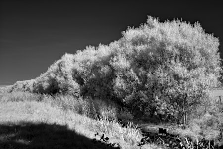
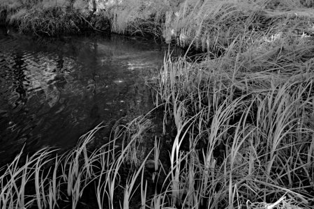
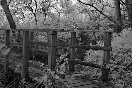
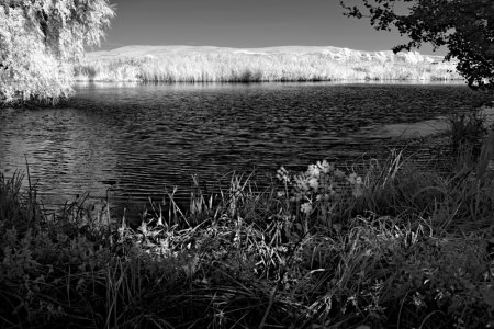
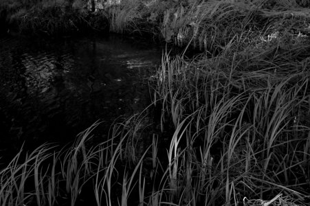
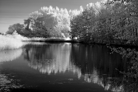
IR at Lanes End

I'm not a great fan of all the freaked-out trees on show in a lot of IR, but I'm loving the grasses in the third shot, Wes. That's a really good shot compositionally too.
 
Thank you Rob, I appreciate that your eye was caught by the grasses- it was one of my favourites of the set for the light dappling. I couldn't decide on how much to let the shadows remain dark to help the highlighted grass stand proud. Would appreciate your thoughts if this was too far


1000013104.jpg
 
I see what you mean, Wes. Hmm. Somewhere in between, maybe, but often that can be unsatisfactorily neither as good as one or the other. You’ll end up dodging and burning, and in my limited experience I inevitably become less enamoured by the image the more I play with it. But I’ll let you worry about that! 😂
 
Haha, oh I am very much the same- your tactful comment has stated exactly what I found - the original post was my middle ground edit- dodge and burn I've yet to get into using, always seems to create an effect I find sickening (like camera phone HDR).

I think that lack of post editing is why I savour using restriction heavy cameras like my sigma, makes me take time to get what I see as close as a I can. Perhaps a touch fatalistic considering what is possible with any computer and a camera these days.
 
I recall a few years back watching a video on how LightRoom could improve your photos. This guy took what I thought was a very good photo and proceeded to make it worse with every technique he used. The encouraging thing was that every single Comment decried what he had done.

I have made similar mistakes many times in the past, but these days I try to do as little as possible, unless I’m really going for a particular effect.

Looking at these grasses images again, I very much prefer the darker of the two. The eye is drawn to the highlighted clump. In the first version - and I emphasis the subjectivity of this - there is far too much information to take in at once.

Your discerning eye is appreciated Rob, the darker of the two was closer to my original vision- I think I've second guessed myself due to sharing these images publicly as what looks best to others; this is a nice reminder to stick to my views.

Slightly unrelated, but how are you and the Mamiya getting along? I've enjoyed seeing what you've been creating with it so far.
 
We’re getting along just fine, but the expense of film (which seems to have shot up recently) and development means we will just skip-out hand in hand on special occasions. I made a few prints from the Oxford trip, and I’m absolutely delighted with them. I think I’ve found my camera.
 
Fabulous to hear Rob, I hear you on the film cost- I've got 6 rolls I need to get developed and feel I may need to slow down as that's certainly💰.

I'll be spending more time with the sigma I can see.
 
Back
Top