Stuck at PP Stage

Brian Moore

Moderator
I had intended to go for a bike ride early yesterday morning but it was foggy and the last time I rode in the fog I broke my helmet and separated my shoulder. So instead, I went wandering about with my Canon 7D equipped with the Tamron 18-270 zoom. (Yes,...I took a digital camera. I've decided I should try to learn how to use the 7D.)

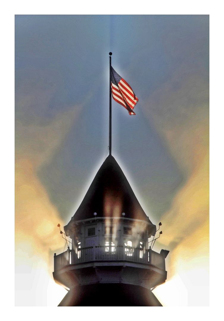
Anyway, returning to my lodgings I glanced up and saw this interesting pattern of morning sunlight.

I shot it in RAW mode, my intent being to make adjustments to it later. So here I am,...later,...and I don't know what I should do with it. As some of you know I don't normally shoot digital, and I never do any post processing other than a slight crop or backlight adjustment once or twice a year, so I'm a little bit lost right now.

If it were yours, what would you do with it? Indeed, is it worth doing anything with? Thanks.

IMG_9305.jpg
 
it'd be interesting to have a few people PP it and see the different in outcomes
 
Well, I hope you don't mind my taking the liberty...

Brian1.jpgBrian2ct.jpg

- - - Updated - - -

These are two of the Nik Silver options - the first is Triste, the second Film Noir 3. I did no tweaking.
 
I'm glad you decided to have a play with another camera Brian and you've certainly captured something very interesting. I guess the real answer is that you can do anything or nothing. It's your art and everyone else can only have opinions. That probably doesn't help though, does it?

I can only tell you where I came from and that's film, like you, for many years. Then my husband got me scanning and I had to start making decisions. Not aperture and shutter speed, but what settings to use when scanning (they seemed endless) and what to do with the resulting digital file. Back then I only knew brightness, contrast and saturation. All done on the background layer...

Then I started running into problems with one particular "purist" on one forum who thought any kind of tinkering was wrong and it bothered me for a long time. But what exactly is "pure"? Take that beach sunset where our eyes can capture the colours in the sky and the detail on the shadowy side of that foreground rock. Anything you take with a single exposure is going to fail. Either the sky will blow or the shadows will block and it's nothing like you remember. So you tinker. You may hand-blend several exposures or run a few versions through Photomatix and it looks much more like the real thing. It's not real though and I don't think it ever was. Back in the good old days we still had to choose colour or B&W. Fast or slow. Slides or not. Medium format or 35mm. Telephoto or wide angle. Then there's the printing. Do you go to a cheap shop where your prints will have a cast and be cropped to a different format, or a top printer who will select certain paper and maybe dodge and burn?

I think what I'm saying is jump in. What software do you already have? If you dip a toe in the water and like it, will you want more software and to spend more time sitting in front of the monitor? Is it going to restrict how much you shoot and would that matter to you? For me... I don't get the chance to go out much and and couple of hours after work/the zoo sitting in a dark and quiet place is pure luxury. You might want to PP everything, or only what you shoot on this particular camera.

Some people may analyse in advance, knowing a particular image lacks contrast or has this problem or that problem that need correcting. I don't think I'm capable of that. I tend to do minimal things in RAW and then in the early stages of CS5, but just to give me a quality file to start with. I like Nik, although I've been very selective about my favourites - they tend to work with only colour and light. Most of my images use the same 3 filters with another 3 used from time to time, so I'm not exactly experimental. I found what I like and I stick with it. That's not right or wrong... just what I feel happy doing.

As for this fascinating photograph of yours - it seems to me what you have to work with are colour and light (and in abundance). There are the incredible red and white stripes and then those amazing light rays. With something like Nik Color Efex you could work on small elements of the photograph while leaving the other bits alone. Or push one area in one direction and do the opposite with the rest. Of course you could do that with layers in Photoshop - I even used them in the basic Elements 3.0. It's only painting effects in and out and can be quite relaxing to do.

I think the most important thing is that whatever you do, you enjoy it :)
 
Me again - sorry! You did ask what would we do with it. If this were mine I would be thrilled to bits. Then I would see what I could do in RAW to produce the best possible starting image. I would probably do an underexposed version to recover the highlights and save that. Then I would get one exposed for the building and combine the two by painting parts of one onto a transparent layer between the two and finally merging down. It's really not complicated or difficult. Then I would boost the colour and saturation in that flag and maybe enhance those light rays - either with Nik, or again, by painting them in with a brightness adjustment layer. I often combine different exposures from the RAW file and so far nobody in here has spotted the join :D
 
it'd be interesting to have a few people PP it and see the different in outcomes
Agreed. That would be cool!

- - - Updated - - -

What a great pattern. It is definitely worth doing something with. What software do you have available?

Thanks Pete. As for software, I have Adobe Elements and I have CS5.

- - - Updated - - -

Well, I hope you don't mind my taking the liberty...

View attachment 3405View attachment 3406

- - - Updated - - -

These are two of the Nik Silver options - the first is Triste, the second Film Noir 3. I did no tweaking.
Thanks for taking a stab at it Rob. I like what that Film Noir 3 did to it.
 
Lesley,...thank you for your two very detailed and thoughtfull responses. I agree completely that its fair to use the tools available to you to reproduce what your eye can see but what the camera cannot in a single snap of the shutter. I guess I am a semi-purist. (Which perhaps suggests I'm only a Semi-Luddite.:))

I like your idea of boosting the color and saturation in the flag and also boosting the light rays a bit. It was them, after all, that caught my eye.

Maybe I'll have a play with it in Elements, which is my only PP software other than CS5.

Thanks again, Lesley. Much appreciated.
 
and for a bit of difference is the iPhone edited one


null-5.jpg
 
D'you know what? I like as is...............really.................honest.
Sometimes there is nothing better than leaving well alone. The shadows in the fog create an interesting focal point, the flag adds to that (shame it's the S&S, an old nationalist song springs to mind now......the stars and stripes fly high over Washington............dedadedadeda..............UNDER the UNION JACK.........ok I have to get out more :D ) Back on track, the softness of the light gives yet more magic to the image. A really nice spot and capture Brian, Sit back and enjoy it as it is.........I certainly have :)
 
If you are using ACR to process the RAW, try going to the HSL tab and pulling the blue luminance slider down some—just enough to put some contrast in the sky. You might also try the blue saturation slider to give it just a bit of a boost. Back on the Basic tab, play with the Clarity slider which will increase edge contrast a bit. A touch of Vibrance should help as well. Look at the histogram and add just enough black to pull the graph so it is touching the left vertical axis. If the result is too dark, either the Fill or Brightness slider to taste will open it up.

Nice shot, and in processing it, my guess is that less is more. On the other hand, do try with much greater values as well. It will alter the meaning, but may produce a nice sense of drama as an alternative.
 
D'you know what? I like as is...............really.................honest.
Sometimes there is nothing better than leaving well alone. The shadows in the fog create an interesting focal point, the flag adds to that (shame it's the S&S, an old nationalist song springs to mind now......the stars and stripes fly high over Washington............dedadedadeda..............UNDER the UNION JACK.........ok I have to get out more :D ) Back on track, the softness of the light gives yet more magic to the image. A really nice spot and capture Brian, Sit back and enjoy it as it is.........I certainly have :)
:D:D Love it Kev!

Actually, the quality of Davie's unholy PP notwithstanding, I think I do just kind of like it as is with the subtle shadows cast by the sun on the mist. Having said that, I like Lesley's notion of boosting the saturation and color on the flag. You built on that a wee bit, Kev, with your mention of the Union Jack. Thanks for that Kev. Now I know what to do. I'm going to change the flag from the Stars and Stripes and make it a saltire! And per Lesley's suggestion I'm going to boost the colors! :p
 
I like Snapseed as a low-cost post-processing option, Windows or OS X, for online images (I have never tried printing from it). It has some of the Nik Software magic and is simple enough to get to grips with fairly quickly. Some of the settings - Ambience and Structure for example - seem able to pull out details in a very interesting way. To begin with I had to resist the temptation to slap the Drama filter on everything but now find some minor Tune Image and Details adjustments can make all the difference to an otherwise flat image. Here I have added a Control Point to the flag to pull up the brightness and saturation of the red stripes. I have then used the Structure control to add a bit of detail to the clouds. The whole approach is very different to working with masks in Photoshop or painting in changes in Aperture. Edit: I try to work quickly as it promotes a very subjective way of working; no numbers at all - just grab the sliders and find out what looks good.

Snapseed does have some shortcomings and irritations and the big one for me is the lack of an incremental undo. Fortunately it is quick to use and I can rapidly re-process an image, but it is annoying that you cannot take one step back once you have applied a filter. The output options are also limited - there is no control over JPEG quality that I could find, for instance. Having said that, I find I can work within the constraints and still be pleased with the output for online displays.

Just my opinion of course but here is a restrained re-working of the image:


IMG_9305_Snapseed by berriff, on Flickr
 
Last edited:
that's some crazy light. here's my go at it. done in lightroom, but should be easily duplicated in any program. color version is nothing more than darkened with an increase in contrast and saturation (except the flag which was masked because it turned yellow/orange).

the b&w version is the color with saturation set to 0. (edit) and a tone curve adj...

IMG_9305-2.jpgIMG_9305-3.jpg
 
Last edited:
If you are using ACR to process the RAW, try going to the HSL tab and pulling the blue luminance slider down some—just enough to put some contrast in the sky. You might also try the blue saturation slider to give it just a bit of a boost. Back on the Basic tab, play with the Clarity slider which will increase edge contrast a bit. A touch of Vibrance should help as well. Look at the histogram and add just enough black to pull the graph so it is touching the left vertical axis. If the result is too dark, either the Fill or Brightness slider to taste will open it up.

Nice shot, and in processing it, my guess is that less is more. On the other hand, do try with much greater values as well. It will alter the meaning, but may produce a nice sense of drama as an alternative.

Thanks, Larry. That's some very clear direction. It's something I need at this stage of my knowledge.
 
I like Snapseed as a low-cost post-processing option, Windows or OS X, for online images (I have never tried printing from it). It has some of the Nik Software magic and is simple enough to get to grips with fairly quickly. Some of the settings - Ambience and Structure for example - seem able to pull out details in a very interesting way. To begin with I had to resist the temptation to slap the Drama filter on everything but now find some minor Tune Image and Details adjustments can make all the difference to an otherwise flat image. Here I have added a Control Point to the flag to pull up the brightness and saturation of the red stripes. I have then used the Structure control to add a bit of detail to the clouds. The whole approach is very different to working with masks in Photoshop or painting in changes in Aperture. Edit: I try to work quickly as it promotes a very subjective way of working; no numbers at all - just grab the sliders and find out what looks good.

Snapseed does have some shortcomings and irritations and the big one for me is the lack of an incremental undo. Fortunately it is quick to use and I can rapidly re-process an image, but it is annoying that you cannot take one step back once you have applied a filter. The output options are also limited - there is no control over JPEG quality that I could find, for instance. Having said that, I find I can work within the constraints and still be pleased with the output for online displays.
Nicely done David. You've enhanced the mist rather nicely. Thank you for the exxplanation and the re-working of the image.

- - - Updated - - -

that's some crazy light. here's my go at it. done in lightroom, but should be easily duplicated in any program. color version is nothing more than darkened with an increase in contrast and saturation (except the flag which was masked because it turned yellow/orange).

the b&w version is the color with saturation set to 0. (edit) and a tone curve adj...

Thanks, Beth. I think I like the BW version better. Nice.
 
it's the quality of the original that counts here Brian, the light was amazing
 
Some wonderful advice here Brian, especially from Lesley. Very little of my personal work is straight from the camera whether from film or digital. As soon as I learned to print I was able to realise what it was that I had wanted in the image in the first place and the digital route is often the same. I don't always know where I want to go with an image though (from either route) and it is at the darkroom / PP stage that the final idea comes together. Of course my technical images are absolutely straight (aside from any colour correction and sharpening that might be required) but otherwise I'm fairly liberal with my view to PP. I'm not keen on many HDR effects and prefer to take away / obscure than reveal but that is simply my preference.

Anyway, I too had a play with your image. I also wanted to increase the saturation and some elements of the contrast and went down the cross-process simulation route via Nik ColorFX. I also use a small amount of their detail extraction filter (although I would guess that wouldn't be needed from the original scan). First though I reduced the exposure a touch in LR, dropped the shadows a touch more and brought the highlights up a tad. After the cross-process I used Nik Viveza to fine tune the exposure of the pole and tower. Finally I sharpened the image in Nik Output Sharpener.

BrianLight-1.jpg
 
Back
Top