Concrete Jungle

Vic Shaw

Senior Member
I don't know about this one, I messed about with it for ages then I realised it wasn't really level so I started again. Couldn't get it right but after all that time I thought I'd post it so you could all pull it to pieces. I was aiming to keep it colour, but with a little mess around I managed to get it a workable B&W.


_DSC6241A.jpg


Vic
 
Hi Vic,

I like the theme here but I can see what you mean as well. There's something strange going on bottom right. Are these artefacts from the capture or are they from persepecive correction etc. How about avoiding them by creating a square crop out of the LH 3/4 of the image and then burning down the distortion on the lower left side (maybe going for a 'Holga' look and feel with a bit of sepia or selenium tone simulation).

Your are right about the slope in my last post. Not sure why I didn't notice. The perspecive corrected version is straight and I suspect I must have accidentally rotated the frame while I was cropping the image slightly. I'll re-crop and replace the source image later today if I get the chance.
 
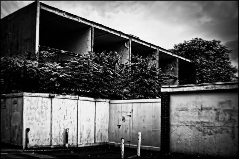
That's kinda uncanny you should mention Holga, the bottom right is caused by a tiny amount of 'zoom burst' added to a layer the the opacity just to try to get the blurred edge in a Holga style. After converting it to B&W it occurred to me that it needed a little edge and urgency, but I didn't want to much. So maybe I didn't add enough because it is far to noticeable in the lower right hand corner and not the others. Not sure if I'd want to do a square crop on this although as the fault is Vic generated there would be no need.

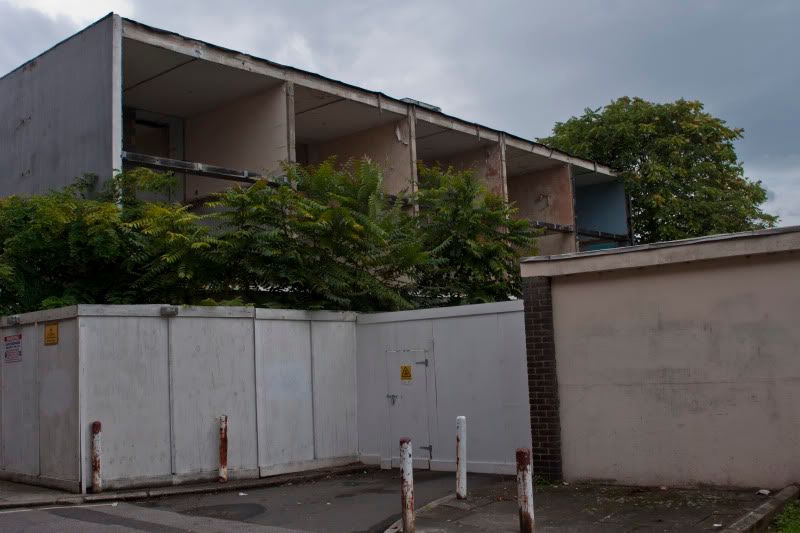
This is a odd picture, I was on my way back to the shop when I stopped quickly to take another picture, although the sky was wrong for this particular shot. These flats were opposite I thought they might be interesting with the sky as it was. When I got home and looked at them they looked pretty uninteresting, pretty much due to poor composition and poor light. It has now become quite interesting to turn it into something interesting.Could it possible be a picture that everyone could have a go at post processing to see what happens to it? Maybe another idea for the forum?
 
Fill ya boots..........Large size on Flickr http://www.flickr.com/photos/vicshaw/5042130369/

smaller file on PB
_DSC6241.jpg


these are the jpegs from the raw conversion, same settings as I started with yesterday

it will be interesting to see what happens to it, Yes I did clone out one bollard it was bugging me.
 
Yes, I really like tinkering with other peoples photos ... I wonder if I can come up with a way to do file sharing for raw files... I'll think on that...
Im gonna have a go at editing this later I think :)
 
Hi Pete,

I have opened it up now, I forgot I had done that.
 
Damn, should have checked before I started. Hadn't planned to do this till later but the car battery was dead so I couldn't go food shopping as planned! Anyway, here are 3 interpretations. The first is a simple perspective correction, crop and curves (plus slight dodge to brickwork) - used a layer mask to keep the detail in the sky. The second is a cross-process simulation done 'manually' in LR with a bit of grain added. The third is a Tintype simulation with yellow filter on Ilford Delta 100 with edited grain (due to size of file) and a coffee stain. Used a control point to hold back detail in the sky (with slightly increased contrast) and overall minor adjustments to micro-contrast to compensate for the small file size. What do you think?

Tried a square crop and, you were right, it doesn't work.

ConcreteJunglePete1.jpg


ConcreteJunglePete3.jpg


ConcreteJunglePete2-1.jpg


Don't ask me why the frame line is wider of the right, I've no idea. It was created with canvas size proportional in PS as usual (unless it is due to the unevenness of the pixel density resulting from a perspective correction of such a small file - usually I distort inwards but I had to do it outwards this time due to the size).
 
Last edited:
Hi Pete,
I think the middle one is the better of the three, I had another little mess with it this morning but it's didn't turn out to well. I was trying your Lomo idea but it turned out to dark. I think that's why I like the middle one, it needs to be a bit brighter.

I might have to go shoot this again I didn't think much of it at the time, but maybe shot later in the day with the sun a bit lower and compose a bit better it could be ok. As it is now theres a little to much perspective correction to do now and it's a little tight in the frame.


Vic
 
Hi Vic,

Yes, I agree. The first was really just the starting point and the first one I did was the mono conversion (done using SilverFX Pro). My original plan was to do create monochrome layer and allow some colour to bleed through but I changed my mind. I also explore the Holga idea a bit further but decided that the vignette it would required was too strong. The laptop I used didn't have the cross-process module I normally use (it's all 64 bit and the plugin isn't) so I used the channels in LR to get where I wanted to be and added texture etc in PS. It's an interesting scene though and one which certainly presents plenty of possibilities. Looking forward to seeing the new shot and Himish's interpretation of this one. Some pipes are coming from me later today.
 
right, i think the temptation with the sort of image is sometime to over complicate things.
by adding a lot of contrast or vignette you are almost forcing the viewer to see the image place in question at "gritty" or "run down"... well i have recently preferd to put forward a more "bleak" idea in my pp if that makes sence
i have found that adding a sort of false feeling of warmth through a slightly cold pink/blue split tone can be very effective at portraying a feeling of bleakness ... so thats what i have done here.... unfortunately i have no idea if it has worked as i have just passed that "i have been staring at this image far to long" threshold :)

_DSC6241-6.jpg
 
Back
Top