Critique Welcomed Good looking Wes.

Thomas brookes

RPF Chief iPhone app Reviewer
A shot taken early on in the day from my BBQ. Alex was away on her hen do so I had the boys around.the aftermath can only be described as 12 hours of carnage.

DSC_9727.jpg
 
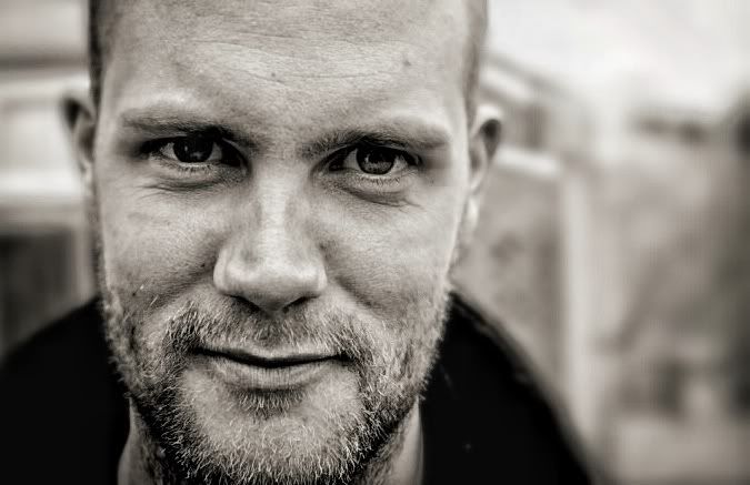
nice sharp portrait, BW does it for me, I like how you have omitted the top & bottom of the guys face. I do think that fence is rather distracting though

Daz
 
You could try ...
It might be a learning curve for next time though ...
As a backdrop for a portrait I go for a texture - like a brick wall... Nothing - white, black, etc to draw attention
Or somthing that would make a good photo by its self - a vanishing point road, archway in a church ... That sort of thing

The fact remains here though that the framing and focus is spot on ... The flat lighting, expression and darkness of the eyes work well to create a look of slightly cheeky, yet very slightly menacing ...
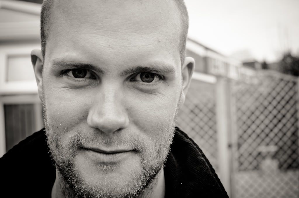
 
I like this very much Tom and have come back to it a few times today. The fence, even though out of focus, is slightly distracting but the expression and intensity override that I think. The only thing I would change would be to crop a tiny bit from the top thereby losing the dark triangle on the left which I think would 'intensify' the look. I often lighten the eyes a tiny touch and increase clarity there specifically (or saturation in colour) as well. I do like this sort of close-up portrait and it work well. What does the subject make of it?
 
Very Good shot Tom, Personaly, I don't have any critism on the shot as I like it just the way it is.
 
Rugged Wes

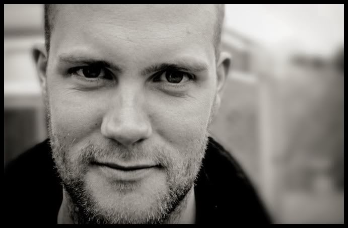
Now has any of these alterations helped. I'm not attached to this shot in any way so experimenting im happy to do. I have cropped as Pete suggested blurred the background hopefully eradicating distractions lightened the eyes and given his wrinkles a little more definition. Wadda ya think?

d7007350.jpg


I know the effects are a little OTT but I did want to follow through with your suggestions. All these where edited on various iPhone apps. This next shot more original and less trying to make your mate ugly.

ae0fa158.jpg
 
I think in part it removes the dark triangle that draws the eye but also it crops the top of the head before it curves too much and that seems to help make the eyes the most important part of the image. It was that curve more than the triangle (although that was the natural point) that made me suggest it.
 
I keep thinking Lock-Stock & Two Smoking Barrels :D

I think the close crop to the face is excellent - the direct eye contact locks the viewer in

Bit of additional toning and sharpening on the subject and a vignette to help focus the attention on the face - all with Topaz B&W

64bee603-461e-4fcc-b369-0f20974b1c5a-l
 
I'd go somewhere between the two of the last pair you posted Tom
The effect on the face is a little strong and because it also effects the background it maybe better used selectively and not a strongly painted over his face ....
 
Back
Top