Life is going to be better!

Nhien Lao

Member
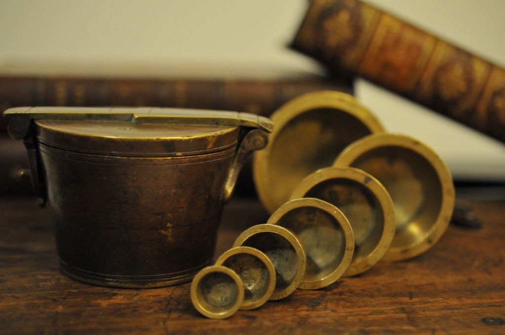
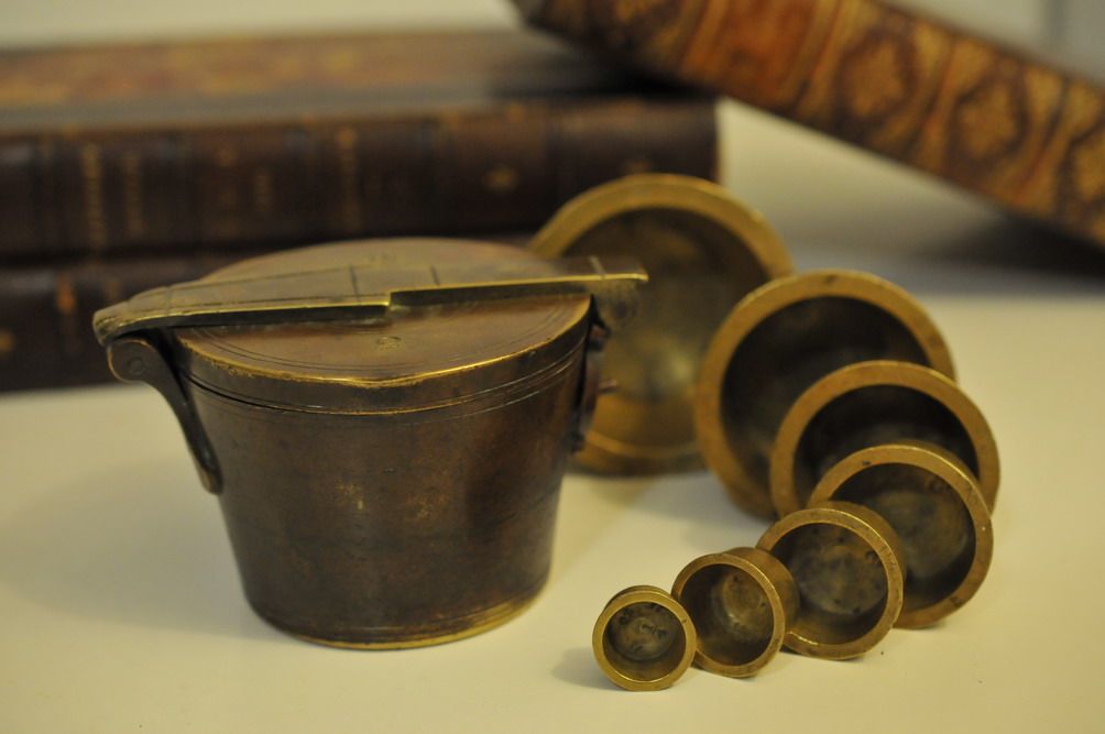
I picked this set of brass weights in a junkshop and decided to make of shot of it. I arranged the weights from small to large with the philosophical idea that life is going to be bigger and better, even though at times we may not be able to foresee it. Some of the big weights at the back are blurred to denote that some of the steps in life are not easy to visualize but they will be better. The biggest weight representing the final step of one’s life was placed in focus to give hope that life will be better with certainty. I put some old books as a background to give the picture a vintage look. Let me know what other arrangements or settings you think that would be more suitable to this set of weights.

I have thought of replacing the white table on which the weights and books are rested with a real dark wood plank but as I am living in the city, it is no easy job. Anyways, I shall try to find one soon to see if it fits better. I think the white table kills the vintage look of the whole composition.

DSC_2943.jpg
 
Last edited:
I like it. I'm currently reading a book on the history of maps ("On The Map" by Simon Garfield - recommended!) and this image resonates with it in an oblique way. Many of the early maps we not concerned with the physical, rather the metaphysical. The map as a guide for one's life. I see a connection here. Also, the weights themselves look like planets in our solar system - another guide map. Something's there you might consider, Nhien?
 
interesting concept. I also have trouble finding 'distressed' surfaces, though a handy table in my local park serves well enough.
 
I like it. I'm currently reading a book on the history of maps ("On The Map" by Simon Garfield - recommended!) and this image resonates with it in an oblique way. Many of the early maps we not concerned with the physical, rather the metaphysical. The map as a guide for one's life. I see a connection here. Also, the weights themselves look like planets in our solar system - another guide map. Something's there you might consider, Nhien?

Ya, I guess planetary idea is probably the first impression people have when looking at those round-like weights. I also have a penchant for maps, especially antique ones. I came across the BBC documentary series "The Beauty of Maps" not long ago. You can check the following Youtube link for the first part. Other parts can be found easily there.

BBC.The Beauty of Maps.1of4.Medieval.Maps. 1/3 - YouTube

- - - Updated - - -

interesting concept. I also have trouble finding 'distressed' surfaces, though a handy table in my local park serves well enough.

Park benches are for sure a great and easy to find alternative. It is just so cold outside here in Canada at the moment. So, I am not very keen to set up the objects outside and shoot.

- - - Updated - - -

What a great idea and a nice shot too. How about a textile in lieu of weathered tabletop? Funny, planets was in my mind when looking at the weights also.

That could work but I just found an old wooden box. I may try with an old cloth later.
 
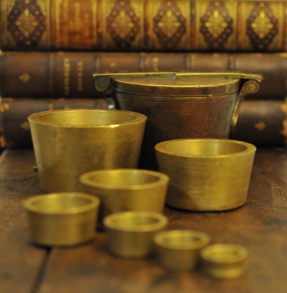
Here are 3 more shots with the newly-found wooden box (not a plank as I was intending to). Let me know which one you like the most.

No 1: same composition as the first shot except replacing the white table with an old wooden box.

DSC_2958.jpg


No 2: a slightly different arrangement from No 1.

DSC_2974.jpg


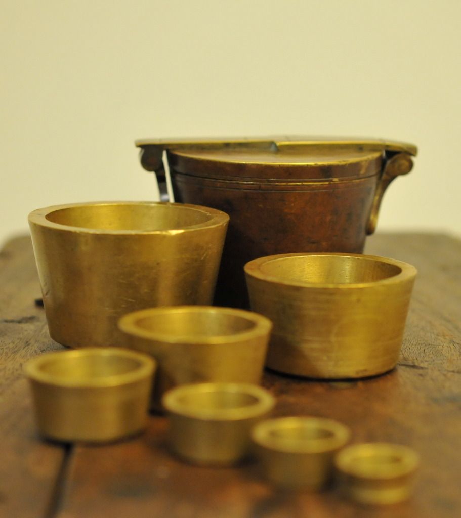
No 3: similar to No 2, but have no book background to denote that the future can be visualized and brighter. Also, to get people's focus more on the main subjects, the weights - steps of life.

DSC_3004.jpg
 
I agree - the second works best. The box is a big improvement. I personally would like a greater depth of field; the foreground weights do not need to be quite so blurred for this composition to work for me. I find the blurred images distracting, but that could just be me having had a few eyesight problems. You could then use a dark Vignette filter to help focus on the central object.

White balance is important and I like the warm ambience you have achieved. For my eyes it could take a touch more warmth to help bring out the colour and texture of the brass. Just my eyes again, perhaps.

This is a lovely composition and those objects have such strong texture. Sorry if you did not want critique, it looks great anyway. I almost deleted the above so please ignore if it is not relevant.
 
Last edited:
Nhien liking the second set a lot. The white table steals the tones from the objects in the first. You have used a classical composition , though quite cleverly inverted it. The stability of composition which comes from the second two images is enforced by the solid objects. Especially with the heavy books.
 
I like the box. The second variant is my favourite I think. In the first, the leaning book takes your eye out of the frame which in some images would work but I think for this idea it is important to end up at the larger weight.

I also think that it is more logical to put the weight in order from small to large, rather than taking the largest weight and putting it aside like in the first shot.

- - - Updated - - -

I agree - the second works best. The box is a big improvement. I personally would like a greater depth of field; the foreground weights do not need to be quite so blurred for this composition to work for me. I find the blurred images distracting, but that could just be me having had a few eyesight problems. You could then use a dark Vignette filter to help focus on the central object.

White balance is important and I like the warm ambience you have achieved. For my eyes it could take a touch more warmth to help bring out the colour and texture of the brass. Just my eyes again, perhaps.

This is a lovely composition and those objects have such strong texture. Sorry if you did not want critique, it looks great anyway. I almost deleted the above so please ignore if it is not relevant.

Thanks for your suggestion. I also think that the picture would have been better if there had been greater DOF. I do welcome critique a lot. Feel free to provide your thought.
 
Nhien liking the second set a lot. The white table steals the tones from the objects in the first. You have used a classical composition , though quite cleverly inverted it. The stability of composition which comes from the second two images is enforced by the solid objects. Especially with the heavy books.

Somehow, I am attracted to old things. That's why I tend to drop by junkshops and pickup some old weird stuffs.

- - - Updated - - -

Such a thoughtful idea Nhien and subtly taken.

Thanks Ahmad.

- - - Updated - - -
 
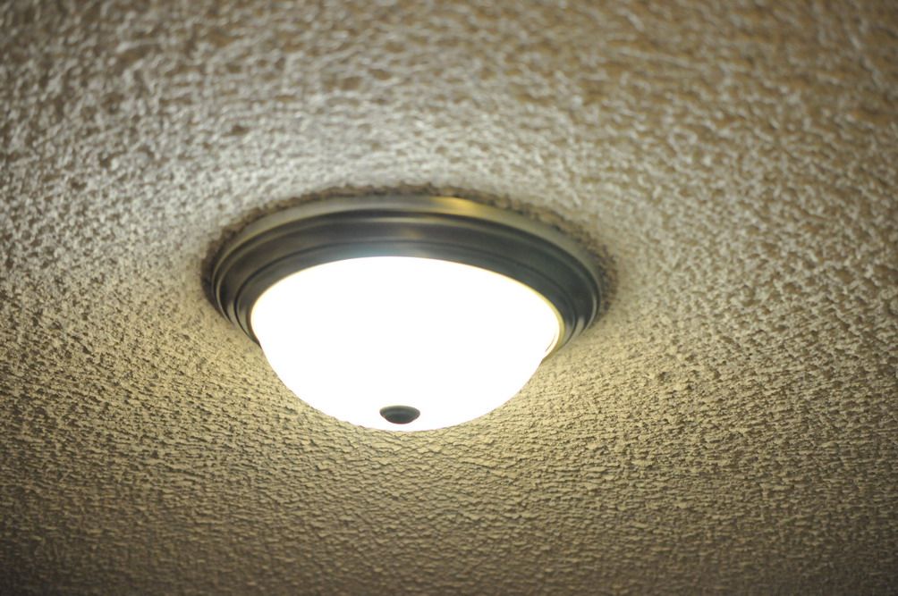
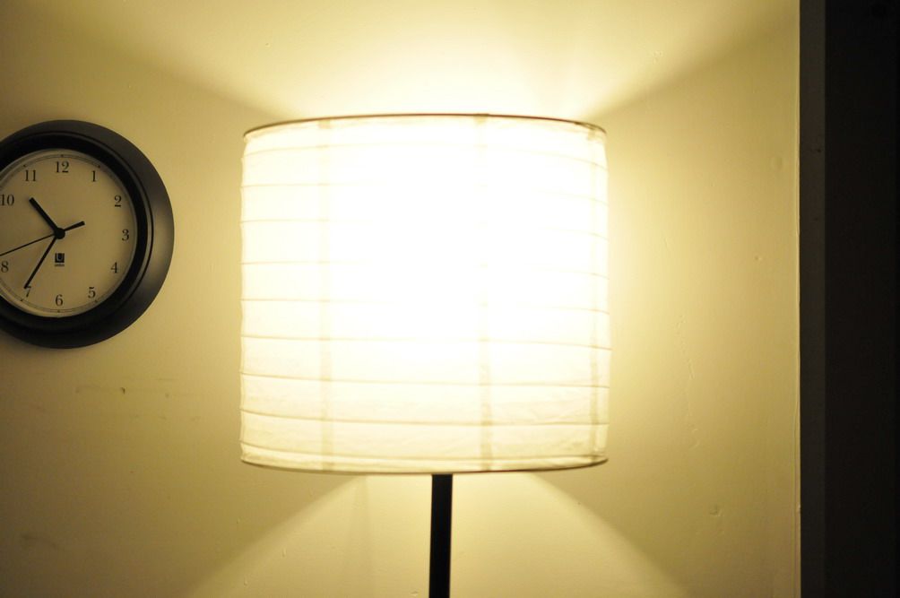
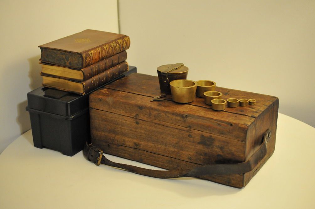
Here are 3 shots of the behind-the-shot set-up. I put the 3 books on a different plastic CD box so that they won’t get much focus as they are not the main subjects. For lighting, a ceiling light and one floor-standing light picked up from Walmart ($10). I think both of them are fluorescent but I chose auto WB for the shot. Somehow, I find that the auto WB even works better than if you know the type of lighting and choose the correct option (just my experience so far).

<>
DSC_3026.jpg

<>
DSC_3024.jpg

<>
DSC_3021.jpg
 
Back
Top