Hi guys,
Brian sent me a note and said my name had come up, so I thought I'd chime in.
First, my portfolio website actually has a lot more photos than most people realize. You have to click on them and then a lot more will scroll. I should fix the format because most people seem to miss that.
As for a critique of John's work, I am happy to provide my two cents but with the caveat that it's just one guy's opinion:
Technical stuff:
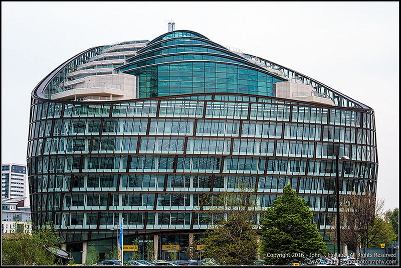
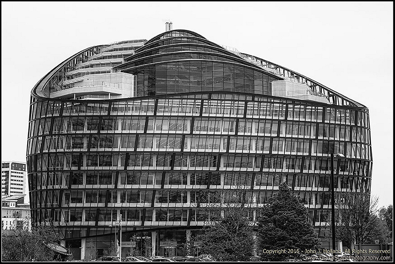
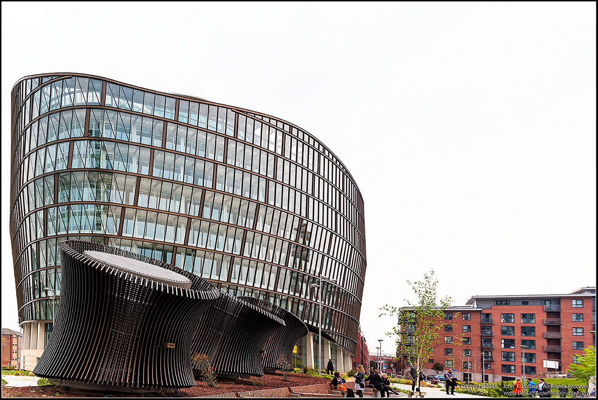
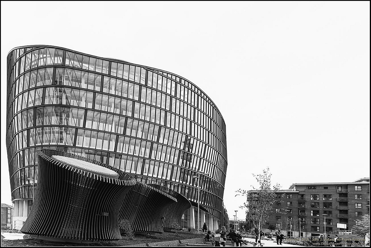
Verticals: It does not appear that the camera was completely straight, as I'm seeing evidence of keystoning on the first shot (both color and mono). Take a look at the tower behind your subject building, on the left. See how it's leaning to the left? I'm guessing it's straight in real life. If you are shooting hand-held or otherwise weren't able to keep the camera completely level, I would highly recommend correcting that in post-production. For most photography, nobody cares and it doesn't matter if the camera isn't completely level. But architectural photographers are a picky bunch, and maintaining the structural integrity of the subjects is important to our clients. Also, for the second shot, the horizon looks distorted and heavily slanted to the right. See how the people are leaning heavily to the right? The brick building in the background on the right looks a bit wonky, too. Was that a correction, or lens distortion, or just my tired eye?
Composition: I know it was mentioned about including more ground and less sky. I would second that opinion. There's a nice amount of sky above, and I think that's fine. You could even add more if you wanted, since it's just flat white. However, what you can't add later in post production is the foreground. In both frames (but especially the first one), you really need to have more ground in the shot. Buildings need to be firmly planted on the ground - both as a way to place the viewer and lead the eye to the subject, and to explain the shot. In photo #1/#2, the crop is awkward because it's cutting the lower half of the cars. That's not a spot that you would typically want to crop a vehicle. I know you didn't want to emphasize the cars, but cropping them that way only draws attention to them. Would highly recommend that you include the whole car and a bit of the pavement, as well. To de-emphasize the cars, burn the lower part of the photograph to darken that part of the frame. Put the cars in the shadows. In photo #3/#4, it's awkward to crop the bench and people the way you have. Again, you want to create an image that is restful to the eye, and that allows the viewer to see themselves and walk through the image. So including a bit of foreground is essential, in that case. Basically, you either want to show enough foreground or none at all (as in those detail/looking up shots you see). Showing only a bit doesn't de-emphasize it - it draws attention to an awkward crop. Also, this crop doesn't leave enough room at the base to ground those cylinders on the left.
Composition point 2: As I mentioned above, you really want to create the space to allow the eye to wander around the composition. For photo #3/#4, you have not left enough room on the left. There's not enough sky there. It creates a visually stressful point that pinches the composition. Do you have more room on the original image? If so, would recommend giving yourself more room on that side. It should be either enough room to not appear too narrow, or cut off completely. Similar problem as above - either give plenty of room or none at all. Not in between.
Does any of that make sense? Happy to explain more. Hope my critiques don't come across as too harsh. I'm just trying to provide real-world editorial feedback.
Overall, the subject and the work is not bad. The photos are reminiscent of the work of Bernd and Hilla Becher, who did a lot of architectural photography in a very neutral way, devoid of people, with flat, white skies. You should Google them if you are not familiar.
Hope that helps!
Best,
Darren
")

