Digital Printing?

I'm a Mac guy but that appears to be the right folder. Red River has information on their website about how to load the ICC profiles onto your computer. Just follow the instructions on their website and you'll be good to go. FYI: A simple color trick is to load different profiles for similar paper from different manufacturers and try their profile on another manufacturers paper. You may like the result better than the correct profile. I use the Epson Velvet Fine Art profile on the Red River Polar Matte 2s and it gives a little more pop and saturation. Not every image benefits ( shadows can be a little blocked up) but you will learn to recognize which images to try with the different profile. Just be sure to screenshot your settings so if you like the result you can repeat the same process. I also put notes in PS files when I want to remember special instructions. I use screenshots all the time to document my steps and then place the screenshots in the folder with the adjusted image file.

The Red River site says there's no real benefit to printing at 2880 over 1440 but let's just say I disagree. I always print for maximum detail. I don't care if it takes an extra minute or two because I'm working on something else while the printer is at work. I want my cityscapes to show every bit of window detail in the smallest building and I want tonal gradations to be seamless. You also need to be careful about 8 bit files. Too much levels and curves can cause banding in continuous tones like skies. Good luck!

 
You also need to be careful about 8 bit files.
Thanks for that Bill. In the past I've been happy with 8-bit files that have been sent out for printing but I'll be on the lookout for stuff I do myself.

So far I haven't had any luck with seeing the ICC files show up as options when I submit a file to the printer. I'm just getting the same three options as always. More digging will be required (and hopefully Red River support will chime in).
 
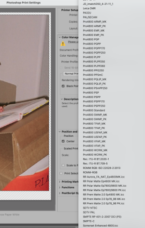
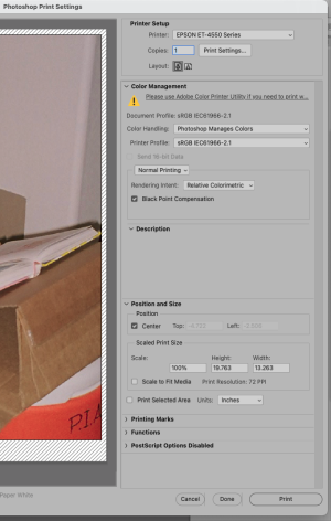
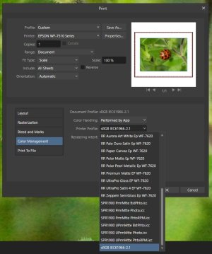
Screen Shot 2024-09-21 at 7.52.37 AM.pngScreen Shot 2024-09-21 at 7.53.25 AM.pngGary, I read the instructions posted on the RR site and it appears you are in the correct folder. Is the ICC profile showing up in the color folder? Have you re-started? You should be seeing a long list of profiles, not just three. I have a smaller Epson ET-4550 and I see the whole list of profiles when I am in the print dialog. I am attaching some screenshots. There should be a list of Epson profiles automatically loaded with the installation of the printer driver for the WF-7510. (See list in my screenshot)
 
I'm not using Photoshop :eek:
...but I'll check to see if Affinity Photo has a similar PRINTER SETUP
<<later that same day>>
It seems to however after importing several, they don't show up as options.
I have printed a single (jpg) matte image on the RR 60lb. Polar matte paper and it looks fine.
I want to see what a *.tiff looks like as well as a b&w.
 
Last edited:
@Bill Brown's apparent knowledge of printing and papers is something I can only aspire to,...I'll never get there. I do a print about once every week or two. Usually it's a test print of whatever image I'm selling that week for my print for Ukraine series. Right now I'm using a Canon Pixma Pro-100. Before that I was using an Epson R3000. But one day I had the bright idea of switching to the matte black ink. (On that printer you select one of two black inks depending on your paper. I had not switched over since I got the thing.) Big mistake. From that point on every print I made had tiny ink blotches all over it. Now it sits in my garage and I'm not sure I'll ever be able to resurrect it. Soon after that happened I saw the Pixma advertised on Craigslist for $20. It belonged to an older lady who's husband--a photographer--had passed away. I told her over the phone that the printer was worth more but she just wanted it out of her home. It has served its purpose well. I use Canon papers. (When I used the Epson I was using Epson papers.) I'm interested in trying some of the papers that Bill spoke about and I'm delighted he has given us some ideas on what to expect from the various types. Thanks Bill.
 
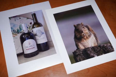
With no luck so far in importing ICC files, I broke open the packets of Red River sample papers this afternoon and made a couple of prints. The one on the right (the squirrel) is a jpg file and it's printed on the RR 60lb. Polar Matte. The one on the left is printed from a *.tiff on RR Polar Gloss Metallic 255. What intrigued me about that shot was the texture on the label on the bottle of Port. I put it on the metallic paper because the Port label seems to also have a shimmer. Since I wasn't able to use a specific ICC paper profile, I used the generic Epson Photo Matte and Photo Glossy respectively.

At this size (8.5" x 11"), I can't see a quality difference between the 16-bit tiff and the 8-bit jpg.

That said, I'm pleased with the results and while I'll likely play with the other papers I'll also likely shell out for some larger sheets since the printer will feed 13" x 19" sheets.
2 prints.jpg
 
Gary, If there is an Enhanced Matte as a choice I would try it for the Polar Matte. Also on the topic of 8 bit and 16 bit tif I know that all photo printers (machines) convert the files to 8 bit(some have a 16 bit option) CMYK in the driver. I'm also somewhat splitting hairs when I talk about 8 bit vs. 16bit. The big advantage with 16 bit is during the edit stage. Always save a separate unflattened master file and a cropped and flattened print file with size specific output sharpening. Just add additional letters to the file ( IMG_0978rtGS, rt=retouched/ IMG_0978rtcpftGS, cp=cropped, ft=flattened) As I make changes I save a new file by adding a number after retouching,rt1, rt2, etc. This way I can always go back to a previous version if needed. I also don't add my initials until I've made a print. I have a client that prints most everything at 8bit sRGB and their clients are okay with that. Even on an 8 bit file I would still use Adobe 1998 if I could. The larger colorspace is probably more beneficial in some instances than the 8 bit thing. The larger colorspace needs to be from the point of capture (RAW processing) or scanning. Just changing the colorspace to Adobe 1998 doesn't give a broader gamut to the original file.

A large part of my personal work is lab scanned 8 bit sRGB files and I'm happy with how they print. I do however know how to maximize all the information both color and detail in a scan. One of the biggest detriments to quality output is jpg artifacts such as sharpening. I say halos only belong on angels not my prints so I've taught myself techniques to help diminish these issues. I know the use of PS can get angry comments but the software can be used in many beneficial ways to improve a less than perfect file. Being a freelance artist means I'm given files to work on that are at times greatly lacking. It's my job to give a client more than they are expecting if I can.

I have had others more knowledgeable than myself teach me how to leverage the power of PS to my advantage. I have also created my own methods to help with recurring issues in photo files. I've retouched since 1976 and have used PS since 2006 when my main client took his studio digital. Being immersed in the process every day can't help but make an impact on my work. My main client, John Derryberry, a premier Dallas portrait photographer has shared tons of his experience and expertise with me. He taught me how to see color. Not what your eye/brain wants to tell you but what is really there. My other client is Photographique. A small family owned lab in Dallas since 1982 which has become the place to go for restoration work. The owner, Cassandra Black, a great plein-air painter and digital master has also kindly passed on a small part of her digital PS knowledge. Without their willingness to pass this knowledge on to me I wouldn't be where I am now. It's a big learning curve and I'm still learning.
 
Gary, since I am new to this forum I was wondering how you placed those camera model names at the bottom of your post? I still shoot with an ftb that I purchased used in 1977.
 
I was wondering how you placed those camera model names at the bottom of your post?
Bill,
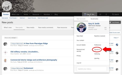
Thanks for all of your insights into my questions, the least I can do is tell you to look at editing your signature.
Click on your name in the black bar along the top and then click SIGNATURE.
signature.jpg
 
@Bill Brown's apparent knowledge of printing and papers is something I can only aspire to,...I'll never get there. I do a print about once every week or two. Usually it's a test print of whatever image I'm selling that week for my print for Ukraine series. Right now I'm using a Canon Pixma Pro-100. Before that I was using an Epson R3000. But one day I had the bright idea of switching to the matte black ink. (On that printer you select one of two black inks depending on your paper. I had not switched over since I got the thing.) Big mistake. From that point on every print I made had tiny ink blotches all over it. Now it sits in my garage and I'm not sure I'll ever be able to resurrect it. Soon after that happened I saw the Pixma advertised on Craigslist for $20. It belonged to an older lady who's husband--a photographer--had passed away. I told her over the phone that the printer was worth more but she just wanted it out of her home. It has served its purpose well. I use Canon papers. (When I used the Epson I was using Epson papers.) I'm interested in trying some of the papers that Bill spoke about and I'm delighted he has given us some ideas on what to expect from the various types. Thanks Bill.
Brian, Thanks for those nice words. Check out this site. It's a wealth of information.

Screen Shot 2024-09-22 at 4.35.34 PM.png

As far as paper types go I think some of the more dramatic ones are for matte inks. William Turner from Hahnemuhle comes to mind. I purchased a sample pack that contained this one and printed some b&w images through the Epson Advanced B&W mode. WOW! Gorgeous. If I can say that about a digital photo paper. Even if you don't think you'll ever get to an advanced place of printing there's no reason your prints shouldn't look their best. The only way to really critique a print is in person so try to find someone in your area that would be willing to give some input. Any labs nearby? Even with digital the production of a master print is still an art with subtle nuance.

Learning how to extract every ounce from a file is a key part. Are your files originating as RAW captures or scanned tifs? If it's a RAW capture then the processing of that file is where the magic all starts. I work with CP 1 Pro and the capabilities of this software astound me at times. My PS time has been greatly reduced as I am able to do more and more of the heavy lifting in the processing stage. I believe the final image looks even more natural when the bulk of the adjustments happen when all the file information is available. If you're starting from a scan then it needs to be a little flat in contrast with the ends of the histogram showing no clipping. Once highlights are lost or shadows blocked up then what is able to be achieved is greatly hindered. I do virtually no adjustments in the scanning software and make sure no sharpening is being applied. The histogram and the eyedropper are your best friend when it comes to getting a nice tonality, mostly in b&w though. The numbers for colors is much less defined so this is where a well calibrated monitor comes into play.

Here are a few basic time tested notes for b&w( printed, not online). First set one eyedropper to grayscale. In brightest highlights a 3% amount is still visible from pure white. Depending on the paper, whether PK or MK, the definition or detail in the shadows will vary. Some matte papers don't show any tone difference after about 93%. Many of the Hahnemule Fine Art Glossy papers will show detail up to 97%. Create a master file of the same image for different paper stocks and put them in folders named for the paper type. I feel that the magic of b&w happens in the midtones. This is where critical curve points are a must. I don't know how deep your PS experience is but shadows in ACR and Shadows & Hilights under Image>Adjustments can do amazing things. I encourage you push beyond whatever you think you're capable of. If you have any questions just ask me. I will help any way I can.

Brian, I went to your website and after looking at your work these are few paper recommendations. COLOR/MK: Epson Velvet Fine Art(more pop and saturation than Photo Rag-better blue rendition), Epson Legacy Fiber____B&W/MK: Epson Legacy Fiber( better shadow detail than Hahn Photo Rag 308), Hahnemuhle Photo Rag 308, Hahnemuhle William Turner_____COLOR/PK: Hahnemuhle Photo Rag Baryta( seems to have a slight warmish bias), Hahnemuhle Fine Art Baryta(very white paper base), Canson Infinity Baryta Prestige( very sharp details) ____B&W/PK: Hahnemuhle Fine Art Baryta, Hahnemuhle Photo Rag Baryta, Canson Infinity Baryta Prestige( very sharp details) Just one mans opinion so take it all with a grain of salt.
 
Last edited:
Brian, Thanks for those nice words. Check out this site. It's a wealth of information.

View attachment 20459

As far as paper types go I think some of the more dramatic ones are for matte inks. William Turner from Hahnemuhle comes to mind. I purchased a sample pack that contained this one and printed some b&w images through the Epson Advanced B&W mode. WOW! Gorgeous. If I can say that about a digital photo paper. Even if you don't think you'll ever get to an advanced place of printing there's no reason your prints shouldn't look their best. The only way to really critique a print is in person so try to find someone in your area that would be willing to give some input. Any labs nearby? Even with digital the production of a master print is still an art with subtle nuance.

Learning how to extract every ounce from a file is a key part. Are your files originating as RAW captures or scanned tifs? If it's a RAW capture then the processing of that file is where the magic all starts. I work with CP 1 Pro and the capabilities of this software astound me at times. My PS time has been greatly reduced as I am able to do more and more of the heavy lifting in the processing stage. I believe the final image looks even more natural when the bulk of the adjustments happen when all the file information is available. If you're starting from a scan then it needs to be a little flat in contrast with the ends of the histogram showing no clipping. Once highlights are lost or shadows blocked up then what is able to be achieved is greatly hindered. I do virtually no adjustments in the scanning software and make sure no sharpening is being applied. The histogram and the eyedropper are your best friend when it comes to getting a nice tonality, mostly in b&w though. The numbers for colors is much less defined so this is where a well calibrated monitor comes into play.

Here are a few basic time tested notes for b&w( printed, not online). First set one eyedropper to grayscale. In brightest highlights a 3% amount is still visible from pure white. Depending on the paper, whether PK or MK, the definition or detail in the shadows will vary. Some matte papers don't show any tone difference after about 93%. Many of the Hahnemule Fine Art Glossy papers will show detail up to 97%. Create a master file of the same image for different paper stocks and put them in folders named for the paper type. I feel that the magic of b&w happens in the midtones. This is where critical curve points are a must. I don't know how deep your PS experience is but shadows in ACR and Shadows & Hilights under Image>Adjustments can do amazing things. I encourage you push beyond whatever you think you're capable of. If you have any questions just ask me. I will help any way I can.

Brian, I went to your website and after looking at your work these are few paper recommendations. COLOR/MK: Epson Velvet Fine Art(more pop and saturation than Photo Rag-better blue rendition), Epson Legacy Fiber____B&W/MK: Epson Legacy Fiber( better shadow detail than Hahn Photo Rag 308), Hahnemuhle Photo Rag 308, Hahnemuhle William Turner_____COLOR/PK: Hahnemuhle Photo Rag Baryta( seems to have a slight warmish bias), Hahnemuhle Fine Art Baryta(very white paper base), Canson Infinity Baryta Prestige( very sharp details) ____B&W/PK: Hahnemuhle Fine Art Baryta, Hahnemuhle Photo Rag Baryta, Canson Infinity Baryta Prestige( very sharp details) Just one mans opinion so take it all with a grain of salt.
Bill,...huge THANK YOU for the advice and the care and time you have taken to offer me such valuable details. I especially appreciate your paper suggestions based on time you spent my website. It will take me some time to digest everything you've offered here and going forward I'll be using your advice as a reference source. Again, huge THANK YOU!

By the way, I tried repeated nozzle cleanings on the R3000, then I tried repeated nozzle cleanings again. No difference. Thanks for that tip, though.
 
I like how they have sample packs geared towards whatever printer you own.
Not only that but they have already prepared pdf's for a wide range of printers targeted at first-time serious printers.

I also received a couple of VERY helpful emails from RR support today 23 Sept (thanks Katrina) and I'll be running through some additional tests over the next couple of days incorporating everyone's input. My goal is to purchase some larger sheets but I'm not yet sure what I want.

Luckily I have a set of ink cartridges sitting on the shelf in the event that I run out.

The other good thing is that this printer gets daily use rather than being a "photo only" device.
 
Last edited:
Bill,...huge THANK YOU for the advice and the care and time you have taken to offer me such valuable details. I especially appreciate your paper suggestions based on time you spent my website. It will take me some time to digest everything you've offered here and going forward I'll be using your advice as a reference source. Again, huge THANK YOU!

By the way, I tried repeated nozzle cleanings on the R3000, then I tried repeated nozzle cleanings again. No difference. Thanks for that tip, though.
Sorry that didn't work. Printers can be a pesky irritation at points but I like the end result when it all works. I just keep putting down my money for more ink and paper. I forgot to mention that Epson Enhanced Matte works well as a proofing paper if the final print is on Epson Legacy Fiber.

Tip: When proofing for final output above 8x10 I first print the total image at 7- 8" on the long side. If there are specific areas of detail I want to check I will create a final version to size with all output sharpening, etc. Then with no cropping parameters entered crop out the area of detail and test that. Something in that same 7-8" dimension. You don't want to print a final and realize you missed something because you couldn't see it on the smaller print.
Great advice. Thanks again, Bill.
 
Back
Top