You are using an out of date browser. It may not display this or other websites correctly.
You should upgrade or use an alternative browser.
You should upgrade or use an alternative browser.
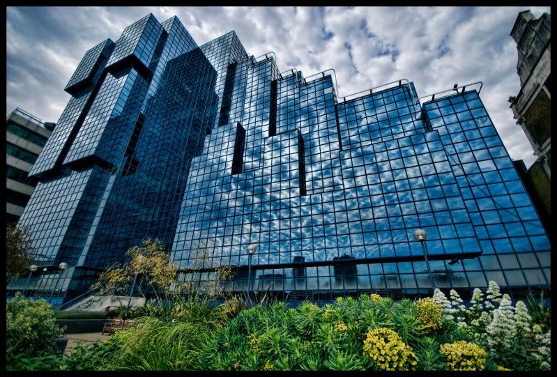
London Window Cleaners HQ
- Thread starter Vic Shaw
- Start date
Pete Askew
Admin
Nice one Vic. Always had a thing about reflections. Border is a bit heavy for me though.
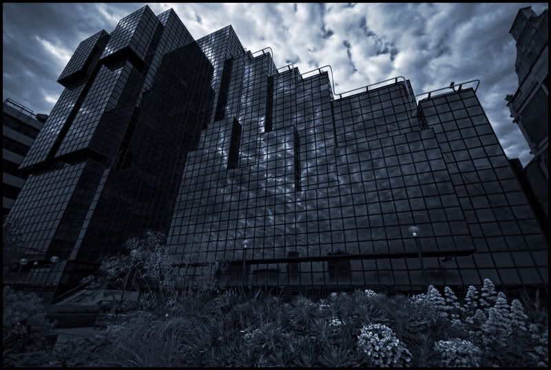
Might be nice in monochome with a blue tone. What do you think? Although I do quite like the contrast.
Might be nice in monochome with a blue tone. What do you think? Although I do quite like the contrast.
Pete Askew
Admin
I agree and often use one as well both for digital and darkroom prints (I especially like using frame edge from 6x6). Sometimes though, especially when there are some near blacks at the edge, I will sample that colour and use that for the border rather than black. Somehow it seems to contain the print better. It might work nicely here using the tone from the building upper right.
Barry Keavney
Well-Known Member
I agree about the border, but I like the colours...
The reflection in the glass is great, and am I the only one that can make a "face" out of the left side ot the building?
The reflection in the glass is great, and am I the only one that can make a "face" out of the left side ot the building?
Pete Askew
Admin
What, the one behind the tank?
Barry Keavney
Well-Known Member
WHAT TANK????? ;-)What, the one behind the tank?
Pete Askew
Admin
It gets about!!
Barry Keavney
Well-Known Member
LOL, Im sure it does!
...but I still dont see it....lol
...but I still dont see it....lol
Pete Askew
Admin
You're right, it hasn't worked. It needs to be lighter and with more contrast. I was thinking of the effect that chemical blue tone has. Maybe a cyanotype-like effect with higher contrast might work. How did you do the conversion?
Vic Shaw
Senior Member
I did a slight HDR/tone mapping in Topaz Adjust, then a basic B&W conversion using the colour sliders to darken/lighter certain colours. Then a level and curves layer added when I was as happy as I was going to get I flattened the layers, dodge and burn next. Flatten again the added 2 new fill layers one green one blue change them to soft light and adjusted opacity. the softlight fill layers is something new I found the other week as I don't RTFM it's a long process for me to learn these things")
Pete Askew
Admin
How about this as idea. Hope you don't mind.

Vic Shaw
Senior Member
thats much better then mine, although the plants at the bottom throw it all out somewhat which is a shame because the building looks good.
I think I tend to go a little to dark at times, almost like I'm scared of the light!
I have no problems with people playing with my shots.
I think I tend to go a little to dark at times, almost like I'm scared of the light!
I have no problems with people playing with my shots.
Barry Keavney
Well-Known Member
Pete, I really like the light and colour in yours, but... the only thing I would adjust is the highlight detail n the cloud texture. Almost like, Vics sky texture with your foreground. Just a suggestion.
Apart from that, the photo and editing look great!
Apart from that, the photo and editing look great!
Pete Askew
Admin
HI Both,
The foreground has a slight green cast which could be got rid of easily in the original file. Due to limitations from teh small JPEG, I did some corrections with channels (mono) but then had to bring a bit of the blue back from the original as I couldn't get the correct shade using colour balance after alone. It woudl be easier to handle on the full-size file. The same is true for the texture. SilverFX from Nik Software would make this a breeze I would think but you could get there with PS alone I would think.
Don't be afraid Vic, the worst that could happen is that you could go blind!!")
The foreground has a slight green cast which could be got rid of easily in the original file. Due to limitations from teh small JPEG, I did some corrections with channels (mono) but then had to bring a bit of the blue back from the original as I couldn't get the correct shade using colour balance after alone. It woudl be easier to handle on the full-size file. The same is true for the texture. SilverFX from Nik Software would make this a breeze I would think but you could get there with PS alone I would think.
Don't be afraid Vic, the worst that could happen is that you could go blind!!
Similar threads
- Replies
- 6
- Views
- 482