You are using an out of date browser. It may not display this or other websites correctly.
You should upgrade or use an alternative browser.
You should upgrade or use an alternative browser.
Critique Required Welcoming the Storm
- Thread starter Stevenson Gawen
- Start date
Gianluca Drago
Well-Known Member
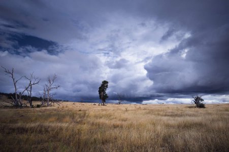
Another nice photo, @Stevenson Gawen! My only doubt: same as in your series "Thistles Live Here" the sky has a somewhat unnatural hue. Am I wrong? (It can be that it's just the monitor I'm using now...)
Stevenson Gawen
Well-Known Member
Thanks! Now, interestingly, the hue in the sky wasn't on my list of doubts about these images... yet now you mention it, yes I suppose it is a bit. I think to me, it just seems darker than would be natural. But an excellent point, and I'm glad you brought it up.
Both these recent posts of mine do have a bit more manipulation of hues and colours than I normally do, partly as I'm trying to familiarise myself with the new color equalizer module in darktable 4.7... so it may be a case of over enthusiasm for a new toy!
Both these recent posts of mine do have a bit more manipulation of hues and colours than I normally do, partly as I'm trying to familiarise myself with the new color equalizer module in darktable 4.7... so it may be a case of over enthusiasm for a new toy!
Ralph Turner
Well-Known Member
I can maybe see a very slight mauve/blue cast in the skies of these images, but then, cloudy skies often do. Getting used to new tools does take a while. I'm probably being a little nit-picky, as I love 'em, particularly the one above
Stevenson Gawen
Well-Known Member
Thanks Ralph!I can maybe see a very slight mauve/blue cast in the skies of these images, but then, cloudy skies often do. Getting used to new tools does take a while. I'm probably being a little nit-picky, as I love 'em, particularly the one above
Gianluca Drago
Well-Known Member
@Stevenson Gawen I saw that you posted a "playraw" in the Pixls forum with a photo from the series. I downloaded the DNG and couldn't reproduce your excellent editing (but didn't take a look at the accompanying XMP file). Overall, a really nice photo, very well developed. Only the sky looks strange to me, but of course the sky is also subject to creative interpretation.
Stevenson Gawen
Well-Known Member
Thanks Gianluca.@Stevenson Gawen I saw that you posted a "playraw" in the Pixls forum with a photo from the series. I downloaded the DNG and couldn't reproduce your excellent editing (but didn't take a look at the accompanying XMP file). Overall, a really nice photo, very well developed. Only the sky looks strange to me, but of course the sky is also subject to creative interpretation.
It was interesting light that afternoon, but I do sometimes find that what I think is good during editing doesn't look right a week later when I come back to it, so feedback is very valuable.
Unrelated point of interest;
In that linked thread, you might notice that some versions posted from other software (RawTherapee and ART) have a kind of coloured vignetting - that's actually caused by the lens and/or sensor in the phone.
The DNG files have a 'gainmap' embedded which is basically a flat field correction, or in effect, an adjustment layer tailored by the manufacturer to correct that.
Darktable applies that automatically, (in fact I'm not sure if one can disable it) so the file looks quite nice right form the start. RawTherapee doesn't - you have to enable it under something like flat field settings, and several participants in that thread didn't do so, with the results one can see.
I actually added vignetting in my version...
Gianluca Drago
Well-Known Member
I actually added vignetting in my version
I have noticed, there is nothing to be ashamed of. Sometimes a well-done vignette adds meaning to the perceiver.
Rob MacKillop
Edinburgh Correspondent
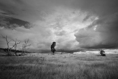
B&W version?
Actually, I’m not focussed on the colours, I just keep getting drawn into the curve on the central tree. There’s drama here that is drawing me in. It’s quite eerie. I like that.
Actually, I’m not focussed on the colours, I just keep getting drawn into the curve on the central tree. There’s drama here that is drawing me in. It’s quite eerie. I like that.
Stevenson Gawen
Well-Known Member
Rob MacKillop
Edinburgh Correspondent
Much better! I didn’t think the colours were adding much to the drama, the story, and if they are not contributing, why have them there at all? To my eyes, this b&w version is more compelling, with no distractions.
Ralph Turner
Well-Known Member
I'm kind of torn as to which I prefer. I do like the b+w version as it separates the main 'characters' a bit better from the background, but the amazing cloud structure loses some of it's drama, looking less ominous set against the pale foreground. It's all personal taste at the end of the day, I guess. Either way, it's a cracking shot.
Gord Tomlin
Well-Known Member
Wow, "Critique Required"...this will be tough, since I like the image. I see where you are going with the colour choices. The sky colour isn't natural, but it's effective. My only real criticism is that the left and right side trees are close to the edges and serve as a bit of a distraction. My eye doesn't want to go to the central tree as much as it should.
A side note to those that visit https://discuss.pixls.us/t/thistles-live-here/42689. If you choose to join and post an edit, you should use an open source editor for your contribution. It's a great community that is committed to open source photography software, and as a result it doesn't welcome edits done with proprietary software.
A side note to those that visit https://discuss.pixls.us/t/thistles-live-here/42689. If you choose to join and post an edit, you should use an open source editor for your contribution. It's a great community that is committed to open source photography software, and as a result it doesn't welcome edits done with proprietary software.
Gianluca Drago
Well-Known Member
Wow, "Critique Required"...this will be tough, since I like the image. I see where you are going with the colour choices. The sky colour isn't natural, but it's effective. My only real criticism is that the left and right side trees are close to the edges and serve as a bit of a distraction. My eye doesn't want to go to the central tree as much as it should.
A side note to those that visit https://discuss.pixls.us/t/thistles-live-here/42689. If you choose to join and post an edit, you should use an open source editor for your contribution. It's a great community that is committed to open source photography software, and as a result it doesn't welcome edits done with proprietary software.
I agree with @Gord Tomlin, Pixls is a nice place to learn and teach (with the limitation of being devoted to open source software).
About the left and right side trees: I see from the comments that for someone they represent a problem. I strongly disagree, for me they are the secondary actors which act as the main actor's sidekick, without them the scene would become less meaningful and more bare. If we really want to find a flaw in the composition, I would have cut off a small slice of the frame to the right so that the central tree (eucalyptus?) would be in the middle.
EDIT: Incidentally, I got myself voluntarily banned from Pixls because I argued with some very zealous site administrators. To this day I don't know if it was my fault or theirs.
Last edited:
Rob MacKillop
Edinburgh Correspondent
To my eye, the off-centredness of the central tree adds to the tension, the drama. If you made it absolutely centred, the drama would lessen considerably. As it stands, it’s like you’ve caught something momentous, in motion. I’d say leave as is.
Stevenson Gawen
Well-Known Member
Thanks @Gord Tomlin and everyone else too! It's so interesting getting different perspectives on this kind of image.
I can't decide which "side" I'm on regarding the centre vs. off centre point. I see both arguments...
I can't decide which "side" I'm on regarding the centre vs. off centre point. I see both arguments...
Ralph Turner
Well-Known Member
The additional trees add to the story of the scene, like some sort dramatic scene. The righthand character seems to be in some sort of anxious dialogue with the protagonist, the crowd on the left looking on. The shape of moody cloud-forms echoing that of the main tree (no I've not been smoking anything ). I'm with Rob regarding the off-centred-ness. I think it works, here, with the other elements.
Rob MacKillop
Edinburgh Correspondent
I can see your quandary, Stevenson. For me, the object is not to produce something that perfectly fits all the ‘rules’ of perspective or some other underpinning of beauty. It’s not about making pretty pictures that are pleasing to the eye. It’s about saying something. I think you intuitively got it right first time, in the moment. There’s an improvised ‘of the moment’ quality to it which is part of the story. It’s almost like looking at wildlife in an African plain. There’s a danger to it.
Ralph’s reading of the protagonist and onlookers chimes exactly with what I was seeing, and initially the colours somehow diminished the immediacy of that. In b&w we see the story unfold more clearly. Yes, it definitely has a sense of danger, enhanced by nothing quite fitting into what photography books and bloggers insist you need to do for successful photography. There’s a time and a place for all that, but not out in the wilds!
Relax. It’s a great shot!
Len Philpot
Well-Known Member
Was this taken at the same location as your thunderstorm pano? Both are really nice.
Stevenson Gawen
Well-Known Member
About 1km and a few months apart! Good spot/guess. And thanks.Was this taken at the same location as your thunderstorm pano? Both are really nice.
Similar threads
- Replies
- 15
- Views
- 542
Critique Welcomed
Altona, Hamburg with the Beast from the East
- Replies
- 0
- Views
- 94
Critique Welcomed
Bridestowe Revisited
- Replies
- 6
- Views
- 490
Critique Welcomed
Another Acquisition
- Replies
- 4
- Views
- 261


