Photos just added - Refractions: a study of light in NYC

Hey gang,
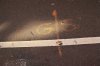
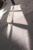
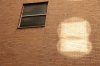
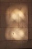
So I just added my first album (a few are shown here but there are more on my profile) and I'd really appreciate some constructive criticism, advice on how to capture the image better in the field and more specifically, how many and which of these images (if any) I should choose for a gallery showing. I have no illusions of grandeur with this showing. It's just something I've wanted to try for a long time. Thanks for your time and wisdom.

Cheers

ps. the photos shown here are not my favorites, just a few for starters.
 

Attachments

  • Yellow GS.JPG
    Yellow GS.JPG
    198 KB · Views: 32
  • Windows on the Floor.jpg
    Windows on the Floor.jpg
    144.6 KB · Views: 30
  • Windows and Bricks Color.JPG
    Windows and Bricks Color.JPG
    143.3 KB · Views: 30
  • Wall and 2 Lights.jpg
    Wall and 2 Lights.jpg
    81.9 KB · Views: 27
  • Three Spots and Red.JPG
    Three Spots and Red.JPG
    129.1 KB · Views: 28
What a great project Josh. It works well. I far prefer the colour images to the B&W ones - I think they become just a bit too abstract in B&W and sometimes you don't know if you are looking at light or a mark of some sort. I think I would also try to be as consistent with format as possible (and maybe processing as well). Occasionally I want to straighten an image (for example the vertical striations in image 5 above) as I find it distracts me from the pattern of the light - but that might just be me. Similarly some of the curvature on the pillars. Otherwise a great series I think. How many are you aiming for?
 
Pete, Brian and Rob,
Great words. I think your suggestions are right on the money. Thank you so much! I'll do some tweaking and see what turns out. As far as processing is concerned I hate to admit this but..... I use iPhoto (as he covers his head waiting for the oncoming barrage). Photoshop scares the hell out of me. It's just enormous and I'm not very technically proficient so it exists as that monster under my bed. This will change with some classes and tips from friends, especially since I'm taking my shooting a bit more seriously. Never-the-less your comments and suggestions are spot on. :)
 
Thanks for the tip, Pete! A few years back I bought Aperture but never took the time to sit and learn it. Is that something worth doing or should I just move on?
 
Josh, great project - we should all shoot a theme or two, it pushes you to new heights I think

Liking these color shots, and particularly the shots where the light has a distinctive pattern, i.e. 2, 3 & 4.

The writing on the ground in #1 detracts from the lighting effect I think, it draws too much attention from the viewer.

Same with the texture in #5 - it tends to overpower the simple lighting effect IMHO.

The sails are just genius - lovely observation and great composition to get the look.
 
I think it is a very interesting project with loads of scope to push further. I don't know if the order was intentional but I think that would work together better if you kept the landscape and the portrait orientated images separate and then separated out into colour and BW.

Do you have a matt cutter? I think these could look really good properly mounted and framed.
 
Back
Top