Rob MacKillop
Edinburgh Correspondent
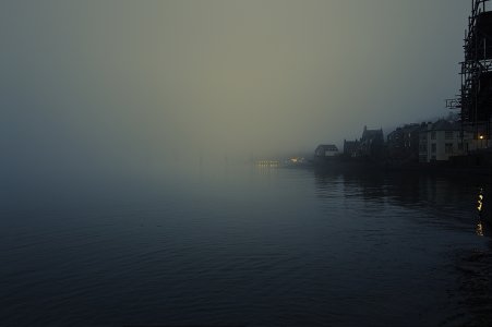
The first was my first colour shot with the Q3, and it initially 'blue' me away, as I hadn't seen anything like that come out of any camera I'd ever had. Tonight I downloaded the Nik Collection which I had many years ago when it first came out. The version (6.8) promised to be much better. So I opened the same image in Nik Viveza and after a short time exploring, came up with the second image, which I actually prefer. I could further dabble with it, should I be moved to, for instance revealing more of the bridge. I've mentioned a few times my struggle with colour in the digital realm, finding a process I could work with. Anyway, your thoughts are welcome, pro or contra.


") just practice though, not one of mine. I haven't shot any color film in 50+ years (but I'm thinking I might).
just practice though, not one of mine. I haven't shot any color film in 50+ years (but I'm thinking I might).
")