You are using an out of date browser. It may not display this or other websites correctly.
You should upgrade or use an alternative browser.
You should upgrade or use an alternative browser.
Shadow and Light
- Thread starter Rob MacKillop
- Start date
Ralph Turner
Well-Known Member
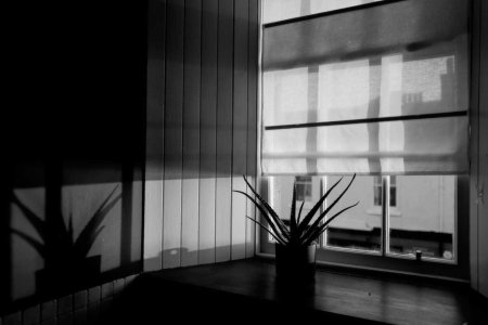
Love it. Beautiful light. I like the way the shadowy chimney pots opposite can be seen through the blind, adding to the other elements in the frame. For a moment the slightly truncated righthand end of the darker band of the blind niggled, then I looked at how the sill in the bottom right of the frame and balances it perfectly. Indeed, the succulent adds a small but vital sense of wild chaos to contrast our human need for regularity. Still pondering that pea on the sill, though...
Rob MacKillop
Edinburgh Correspondent
Haha, I’d forgotten about the ‘pea’ or whatever it is. I’ll rename it Portrait of a Pea, and it will win some award somewhere.
Good thoughtful comments, Ralph.
Good thoughtful comments, Ralph.
Gianluca Drago
Well-Known Member
I like the shade of the succulent plant. I probably don't know what I'm saying, but I would cut out almost everything else (I did a test and it seems to work extremely well).
Ralph Turner
Well-Known Member
Interesting perspective, Gianluca. You've got me playing around with bits of card to crop it this way and that. I see what you mean. There are also a few other variations, too, that have potential... I think, for me though, the image works best as a whole. It's surprising what the 'Scalpel of Personal Taste' can come up with, thoughI like the shade of the succulent plant. I probably don't know what I'm saying, but I would cut out almost everything else (I did a test and it seems to work extremely well).
Gianluca Drago
Well-Known Member
If this was a "Play Raw" or a a "Play JPEG"...
Rob MacKillop
Edinburgh Correspondent
Well, this is fun. There’s something about the image that just doesn’t work, so the temptation to play around with it is strong. Some interesting suggestions there.
Ralph Turner
Well-Known Member
Is there such a thing as a perfect photo? I remember the guy that ran a photography evening class at our local tech college often saying something along the lines of "if you've taken what you feel is a perfect shot, it's time to hang up your camera and pursue another interest". I think there's some merit in that. He was a bit of a character, though. Ex London fashion 'tog from the '60s & '70s. He never did say why he gave up that 'glamorous' world to run a chemist and photo shop on the Isle of Wight... anyway, I ramble. Sorry 


Rob MacKillop
Edinburgh Correspondent
He obviously took the perfect shot, and hung up his camera. It would be good to see it!
Ralph Turner
Well-Known Member
Lol.He obviously took the perfect shot, and hung up his camera. It would be good to see it!
Brian Moore
Moderator
I can't not see that pea. You've placed it perfectly.
Rob MacKillop
Edinburgh Correspondent
Zoom in, right of the plant.
Brian Moore
Moderator
I said I can't not see it.Zoom in, right of the plant.
Rob MacKillop
Edinburgh Correspondent
So you did! 
Ralph Turner
Well-Known Member
He a was a bit of a funny old b*gger.... (no, wait, so am I nowHe obviously took the perfect shot, and hung up his camera. It would be good to see it!
Bill Brown
Well-Known Member
Rob, The weight of the black on the upper left is pulling me too much to that spot. Maybe just the whole image a little lighter instead of opening up the shadows? I would like the hilites on the right grabbing a little more of my attention. That's my 2 cents worth.
Rob MacKillop
Edinburgh Correspondent
Fair comment, Bill. I can’t get home for a while, and my phone isn’t equipped for the subtlety I require, but I’ll keep it in mind. Thanks for your thoughtful comment.
Pete Askew
Admin
It is indeed an ‘almost’ satisfying shot. I like the dynamic rand and would personally not change the shadows. However, I would alter the verticals.
Rob MacKillop
Edinburgh Correspondent
Pete, I recall you were once Chief Inspector of the Horizontal Police - @Brian Moore will recall - and now you are climbing the ranks of the Vertical Police! Take some drugs, lie down, all will be well 
Pete Askew
Admin
What can I say, it was an upward move I couldn’t resist! 

