Critique Welcomed Ship of Theseus

It IS good to see Brian back after a short absence (congratulations, grandad!). I can’t imagine this place without Brian. Although you’ve developed into an excellent digital photographer, Brian, especially in architecture and landscape genres, it is your film work which brings out a more playful quality, leading to me to think you enjoy film work more. Is there something in that?
Thank you, Rob. Very appreciative of what you have said.

"Is there something in that?"
There absolutely is. I explained a little about how I feel shooting film in another thread. But I was talking there more about the tactile sense of handling a film camera. Your question here is more about the emotion than the tactile feel. You hit the nail right on the head when you mention the playful quality in some of my film photos. Being among people and shooting without too much concern regarding composition or exposure values has always been a lot of fun for me. Often the pictures are rubbish, but occasionally I like them. I'm delighted and thankful you do as well. Thanks again, Rob.
 
Gianluca, I will start with more of a global critique. As you move through a location be more open to varying perspectives. Get low and look at a scene. Move in closer to create a forced perspective. Think about why you want to take this photo. What is attracting you to this scene? What would it look like if you moved in close to that boulder at the roofline? Instead of thinking in a straightforward documentary way maybe it could be pushed more into abstraction. Look for the shadow play against the building. Imagine that you are shooting with TRI-X. Would you think differently about what you wanted to shoot?

The camera is a tool that will do what you ask it to. It has no preconceived ideas about what it wants to capture to it's memory card. It's waiting for your direction. Make it do what you want. Think about how you might do post adjustments later. If you exposed it a certain way how would that influence your editing choices? Moving a color image to b&w requires a different way of looking at an image. How can you use the colors to manipulate the tones? I believe as others do that a great b&w conversion starts with as a nicely color graded image. I know what you mean about getting lost in the edit. This problem arises when you aren't for sure where you're headed. I've learned over the years that a b&w conversion can go so many different directions that you have to take it where you envision it. This envisioning though is based on all the great b&w work that you like.

Great b&w work is as much about tones as it is subject. My opinion anyway. How can you use all the range of tones or do you want to compress the tonal range? One of the keys to a good conversion is the placement of the points on the curve. Look at your photo. How does the tone seperation affect the image as you move the location of the points? What objects or texture do you want to expound on?

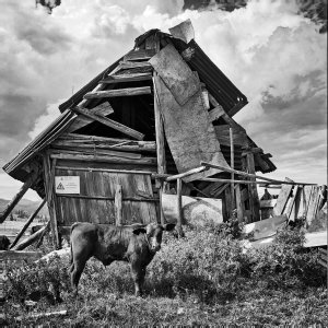
My observations are based on a color calibrated monitor. That's the starting point. You must be calibrated or you are wasting your time. My editing style is based on what it will do as a print. Online viewing is all based on each persons digital device but a print forces you to fit into a specific set of parameters. Don't tweak any colors until the WB and contrast range are correct. I describe getting the WB correct in this way. It's like two sets of gears that fit together in a specific way in order to work properly. They will still turn even if they are misaligned but when meshed correctly they move freely. When colors are synced together you get the deepest blacks and beautiful whites. This is why you shouldn't adjust the contrast until the color is correct. This is a very simplistic description of a somewhat more complex procedure. Let's take a look at the cow with barn conversion. I would look at the barn wood tones and the cloud tones. If I placed two points on a curve where would I get the most dramatic tone seperation. I rarely use more than two points on a curve. My opinion is it's better to do a second curve with new points. Sometimes I will create a dramatic S curve then drop the layer opacity down. This method allows for real time critiquing without moving the points on the curve.

Do you want more image critiquing or do you like me to describe some of the edit process also?
 
You are right, basically I tend to be documentary in photography and even when I try to look at the subject with a more creative (I don't want to say artistic) eye, I can't abandon the prosaic nature of the everyday. But of course your shooting tips could come in very handy if by chance I manage to make the leap to the other side one day.
Interesting how you place a lot of importance on good colour calibration before conversion to B&W, which is what I normally do too, only with mediocre results, unfortunately.
As for the editing process, of course I'm interested, but I imagine it will be very much influenced by the software tool used, which in my case is Darktable.

I'm not asking because I have a shred of modesty left, but what I'd really like to see is how you would edit this photo.

Thank you, I really appreciate the effort you put into your reply.
 
I think I should abandon this point-and-shoot and go back to something more serious.
The great thing about the LX100 is that it is small and very convenient. That said, I abandoned mine for a gx85 due to the limitations of the fixed lens - it just wasn't long enough (although it does very well as a macro lens).

I like a couple of the shots you posted.

Just remember who you are shooting for and why you enjoy going out to shoot.
 
It is small and this was the main factor I took into consideration when I bought it. The fixed lens is a problem, a real problem. It's good when you use a medium aperture (like 5.6), but it quickly shows its limitations when you close or open the aperture more, and the same goes for the zoom, so in the end you're stuck using a fixed aperture and a fixed zoom. Also, it's a dust vacuum (a couple of times I had to use a real hoover to remove dust and hair, even when I treated the camera with extreme care). But I love the fact that you can operate all the gears without going into the digital settings.

Just remember who you are shooting for and why you enjoy going out to shoot.

I don't know who I'm photographing for or why I like taking pictures (I don't even think I like it, actually). And I probably don't want to know. :)

Thanks for the feedback, Gary.
 
You are right, basically I tend to be documentary in photography and even when I try to look at the subject with a more creative (I don't want to say artistic) eye, I can't abandon the prosaic nature of the everyday. But of course your shooting tips could come in very handy if by chance I manage to make the leap to the other side one day.
Interesting how you place a lot of importance on good colour calibration before conversion to B&W, which is what I normally do too, only with mediocre results, unfortunately.
As for the editing process, of course I'm interested, but I imagine it will be very much influenced by the software tool used, which in my case is Darktable.

I'm not asking because I have a shred of modesty left, but what I'd really like to see is how you would edit this photo.

Thank you, I really appreciate the effort you put into your reply.
Gianluca,

Here's a totally different approach. It has the tonal range I like to have but may be too radical for your taste. 40 minutes in post( PS 2024) some ACR adjustments followed by levels, curves(with custom layer masks) and B&W layer(some color adjustments). Also dodging and burning selectively. Did not print it so tweaks would probably happen. I think a tinge more shadow detail may be in order(barn). This is my starting point. Give me your gut response and I'll adjust as you like.

- Bill

dc-lx100m2-PAN3456_01_BB.jpg
 
Thank you, Bill!
Certainly your editing is much richer in detail and more realistic too. I like your editing. Perhaps in my editing I wanted to achieve something darker, almost sinister, somewhat dreamlike, but to be honest I do not remember what my intention was and I am only trying to justify the mediocre result.

Thank you very much for giving me the opportunity to confront myself with the skills and vision of another person, much more qualified than me.

I didn't think you would accept my proposal otherwise I would have made the Raw file available to you straight away. Anyway you can find it here if you are interested: https://drive.google.com/file/d/1NvE7g1reE1zc82zIAL9N89aqBXzoTn9g/view?usp=sharing
But, Bill, you've already spent so much time on this photo and I don't want you to waste any more of it, it's not a photo I would print (actually I never print my photos).

And of course the file is also available to all other forum members who would like to try their hand at editing and providing their own interpretation of the scene (whether realistic or creative). So that there are no obstacles, I release the photo in the public domain under a CC 0 licence.
 
I agree with Rob’s comments in his first post (I also agree with most of what he added later, but that is not important now!) and the tonality and use of colour suit these images well I think. And not only are they a super record of the place as you found it, they are great images in their own right. The B&W conversion is effective as well, but it is very much a photograph than a record whereas the others are clearly more records that happen to be super images too.
 
I agree with Rob’s comments in his first post (I also agree with most of what he added later, but that is not important now!) and the tonality and use of colour suit these images well I think. And not only are they a super record of the place as you found it, they are great images in their own right. The B&W conversion is effective as well, but it is very much a photograph than a record whereas the others are clearly more records that happen to be super images too.

You know I take your comments in the greatest consideration, Pete. Thank you!
 
I like the b&w most. The clouds, the dilapidated hut and a cow, seeming to be interested in the photographers activity.

Thank you for your comment, Detlef. I dare not ask which B&W you are referring to, whether mine or Bill Brown's (but I fear I already know the answer 😉).
 
More than one of you liked the last photo (thanks for the feedback), and Rob suggested black and white. I had already tried B&W, but it was rather bland, now I'm going to try again. The problem is that the more I immerse myself in the pleasure of editing, the more I drift away from reality and in the end I am no longer able to judge the result. I get lost in digital translation, I hardly accept the fact that translating is a bit of betraying. I don't know, You be the Judge of the 'Golden Calf'.
I think this works extremely well in black and white. The contrasting light and dark areas provide a greater degree of visual interest, in my opinion. It encourages me to spend more time admiring the photograph.

 
I think this works extremely well in black and white. The contrasting light and dark areas provide a greater degree of visual interest, in my opinion. It encourages me to spend more time admiring the photograph.

Thank you, Tony, there's always something to learn from someone else's opinion.
 
Back
Top